
Go Back
THE ISLAND
Designing an immersive, community-driven eCommerce experience
Role: UI/UX Designer
Platforms: Website and Mobile App
Duration: 2 months and continuing
The Brief: Build a platform that feels like a physical retail island where users enter via a 3D game experience, explore brand stores, earn rewards by playing, and checkout without breaking immersion all while letting brand owners fully customise their storefronts from a CRM backend.
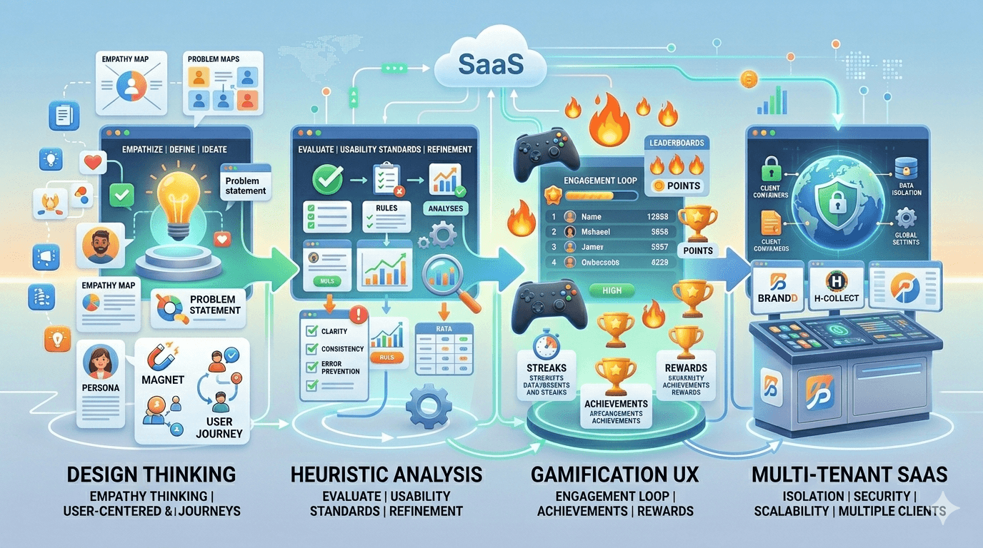
Frameworks Used
Frameworks used: Design Thinking · Heuristic Analysis · Gamification UX · Multi-Tenant SaaS
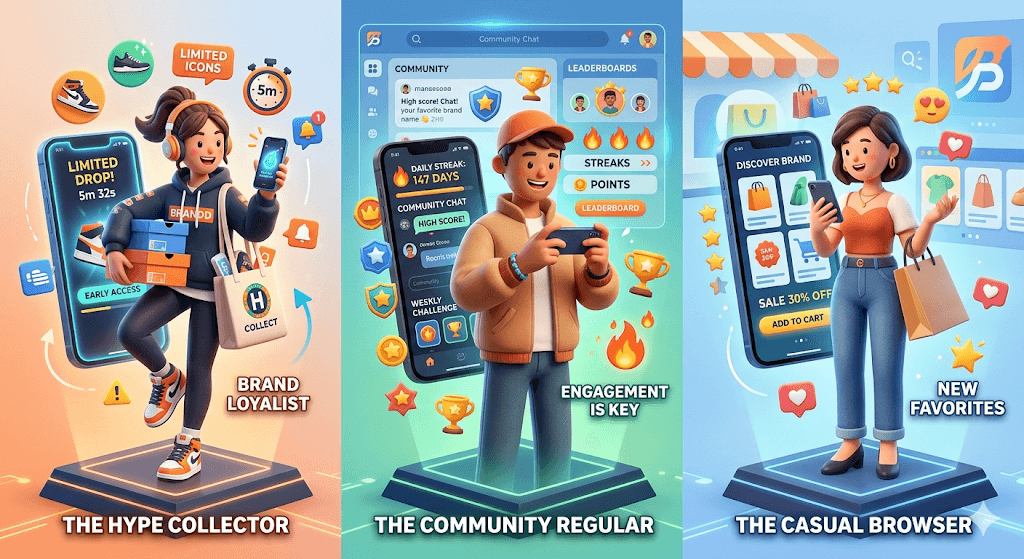
User Persona
Defined three primary user personas:
The Hype Collector — Waits for drops, wants early access, brand loyalist
The Community Regular — Engages with games, streaks, community feed daily
The Casual Browser — Enters via a brand, browses, converts on discovery
Competitive Landscape- Discovery & Benchmarking
Direct Competitors: Conducted heuristic analysis of :
Myntra — Fashion-forward but brand identity gets lost in category grids. No community, no gamification, no drop culture.
Flipkart / Amazon India — Mass-market deal-driven. Brand becomes a filter, not an experience. Gen Z doesn't feel seen.
Ajio — Curated fashion, still product-first. No immersion layer.
Meeshu- Mass-market deal-driven
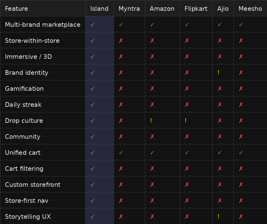
Indirect Competitors
Supreme / Fear of God DTC — Strong brand identity, but single brand only.
SNKRS App (Nike) — Drop culture nailed, limited to Nike ecosystem.
Discord communities — Community layer without a purchase layer.
Design Inspirations
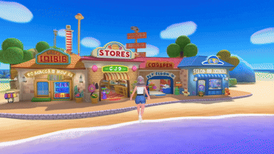
Coastal World & Igloo — Reference for 3D immersive web island navigation and spatial storytelling in browser.
Modern fashion DTC sites — Editorial, clean UI that inspired the monochromatic premium visual language. (Almost Gods, DeadBear, Gully labs, H&M, Zara)

After competitor analysis we found out the problem space —
The gap no one was solving
"Myntra sells products. Flipkart sells deals. The Island had to sell identity." — Core Design Positioning Statement
The white space: No platform in India gave Gen Z streetwear brands a native, immersive, store-within-a-store experience with gamification, community, and drops all under one roof.
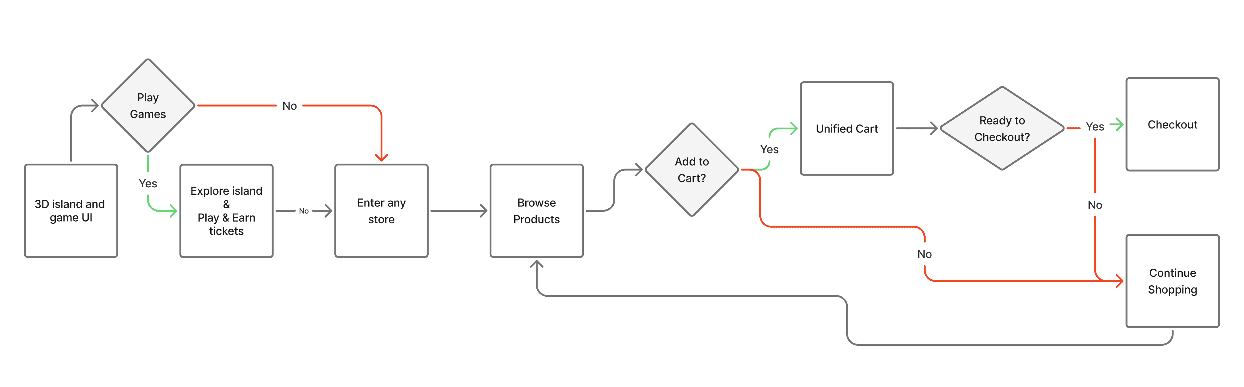
User Flow Architecture
Mapped two parallel flows:
Primary Flow: Island Landing → Play & Earn → Enter Store → Browse Products → Unified Cart → Checkout
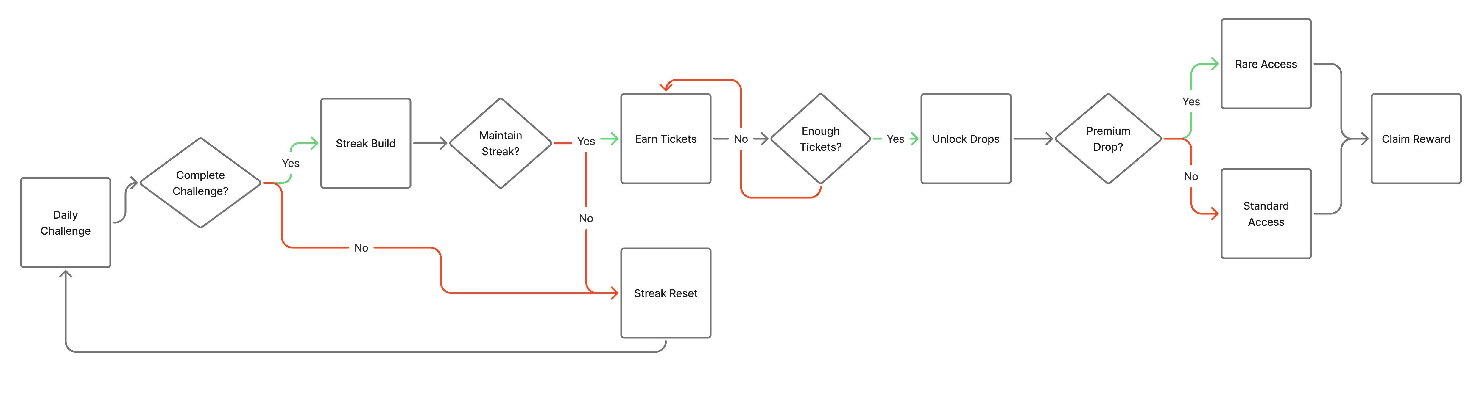
Engagement Layer: Daily Challenge → Streak Build → Earn Tickets → Unlock Drops → Rare Access
Both flows converge at the same cart and checkout logic. Used Jobs-to-be-Done framework to ensure every screen answered: "What is the user trying to accomplish right now?"
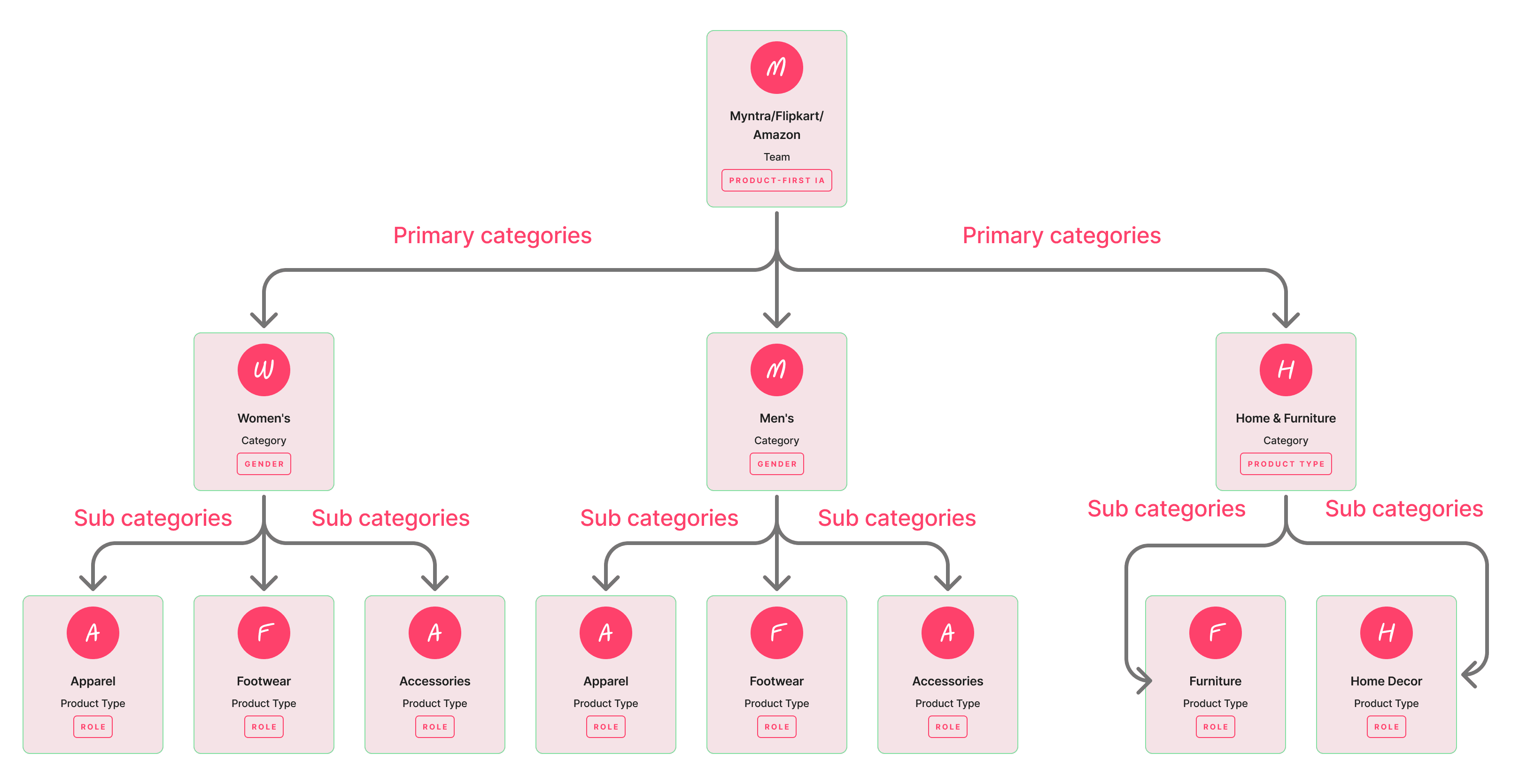
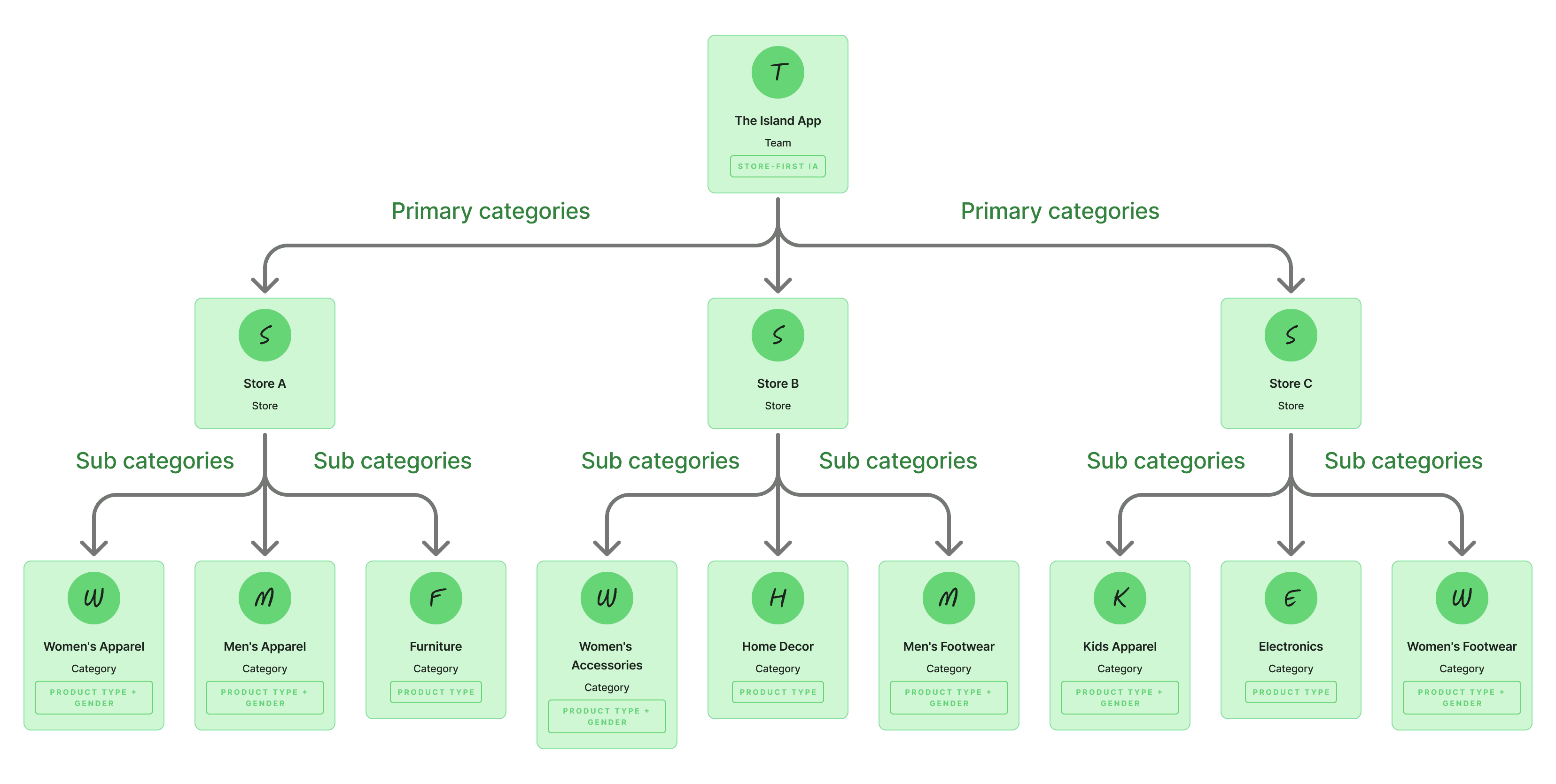
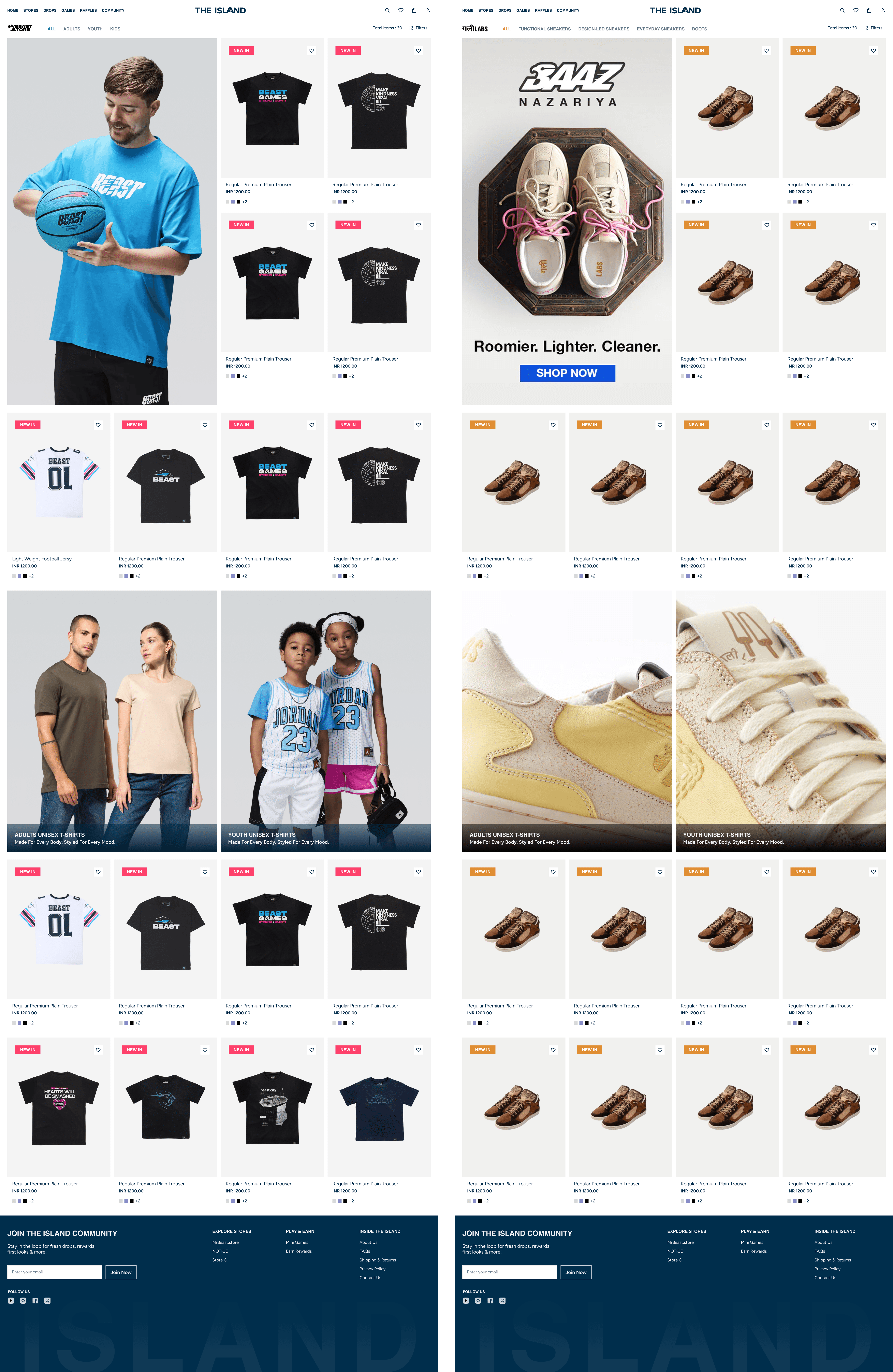
Information Architecture
After analyzing platforms like Myntra, Amazon India, and Flipkart, I found they all follow a product-first IA, users navigate through categories, while brands function primarily as filters.
For The Island, I restructured this approach:
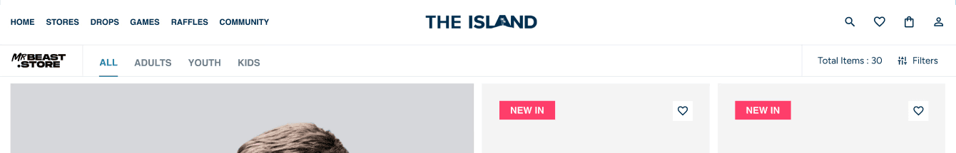
Primary axis: Stores
Secondary axis: Products within each store
This introduced complexity, as each store could have entirely different product types and category structures.
To address this, I designed a dynamic, store-aware filtering system where filters adapt based on each store’s inventory. The system is also integrated with the CRM, allowing store owners to easily manage and update categories and filters without breaking the overall experience.
Challenges: How I worked through the complexity
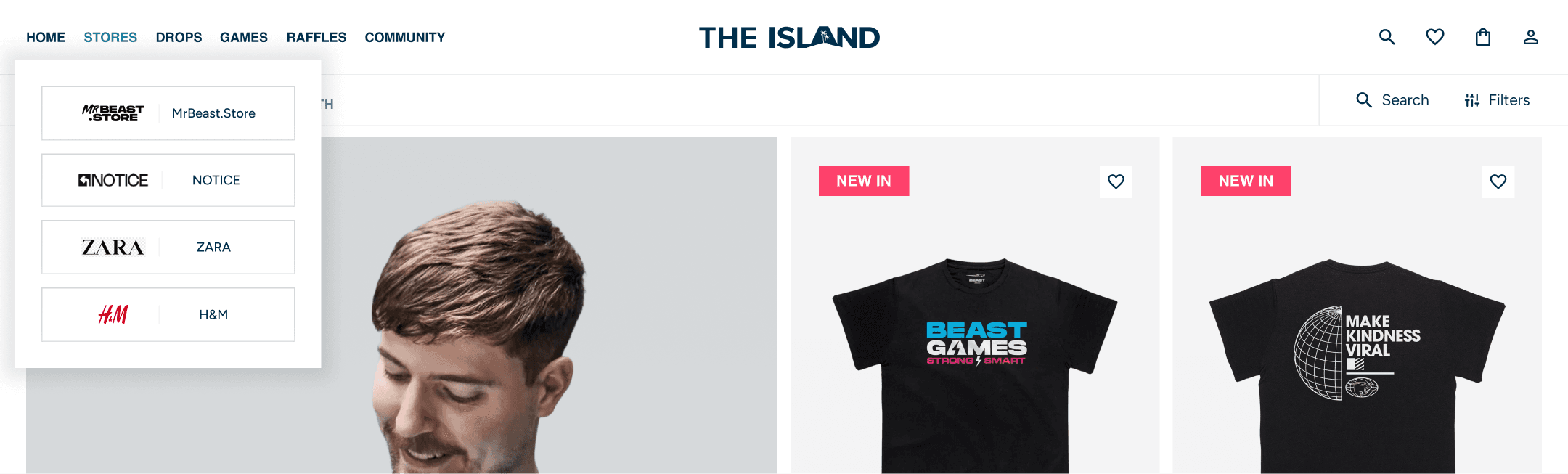
Challenge 01 — Multi Navigation and store selecting
Challenge:
The platform needed two navigation layers a global island navigation and a fully customizable store navigation managed by store owners via CRM. The goal was to maintain clear separation while allowing flexibility and preserving each store’s identity.
Client said:
“Each store should feel completely independent.”
The UX reality:
Complete isolation creates friction. It limits cross-store discovery and forces users to return to a central home to switch stores — breaking flow and working against the platform’s community-driven nature.
What I did:
I designed two distinct navigation systems one for the island and one for each store’s identity and structure. To balance isolation with exploration, I introduced a subtle store switch option within the main navigation always accessible but non-intrusive, enabling seamless switching without disrupting the user’s current experience.
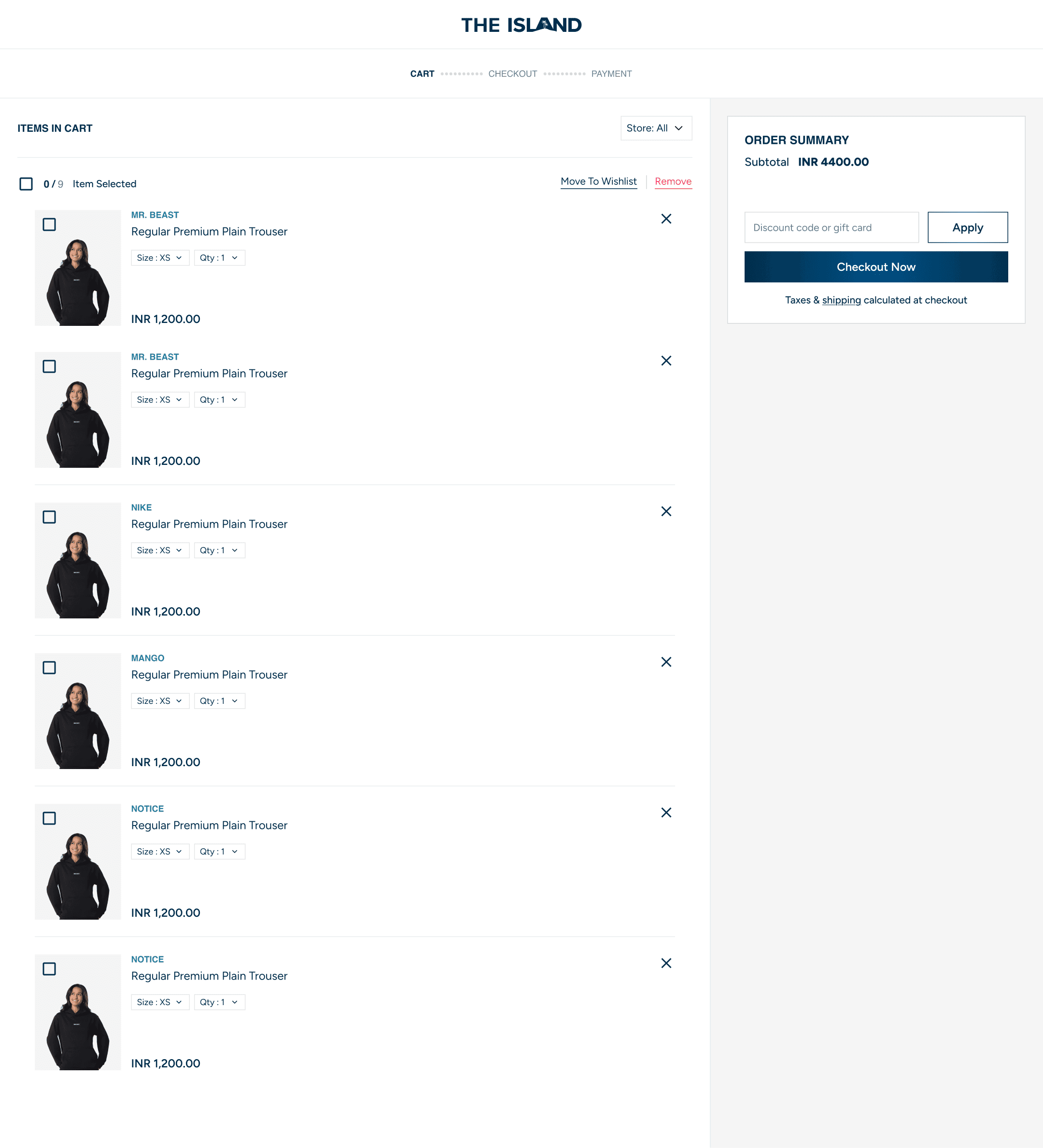
Challenge 02 — In store Cart & Checkout
Client said: “The cart should only show products from one store at a time. Each brand needs to have its own separate cart experience.”
UX reality: Keeping every store completely separate creates friction for users shopping across multiple brands. They would need to switch between stores and potentially checkout multiple times, increasing effort and the chance of cart abandonment.
What I did: I introduced a store filter within the cart. By default, users first see the current store’s products, preserving the client’s brand-focused experience. Alongside that, I added a “View All” option and a single “Checkout All” flow, allowing users to review and purchase products from every store in one seamless checkout.
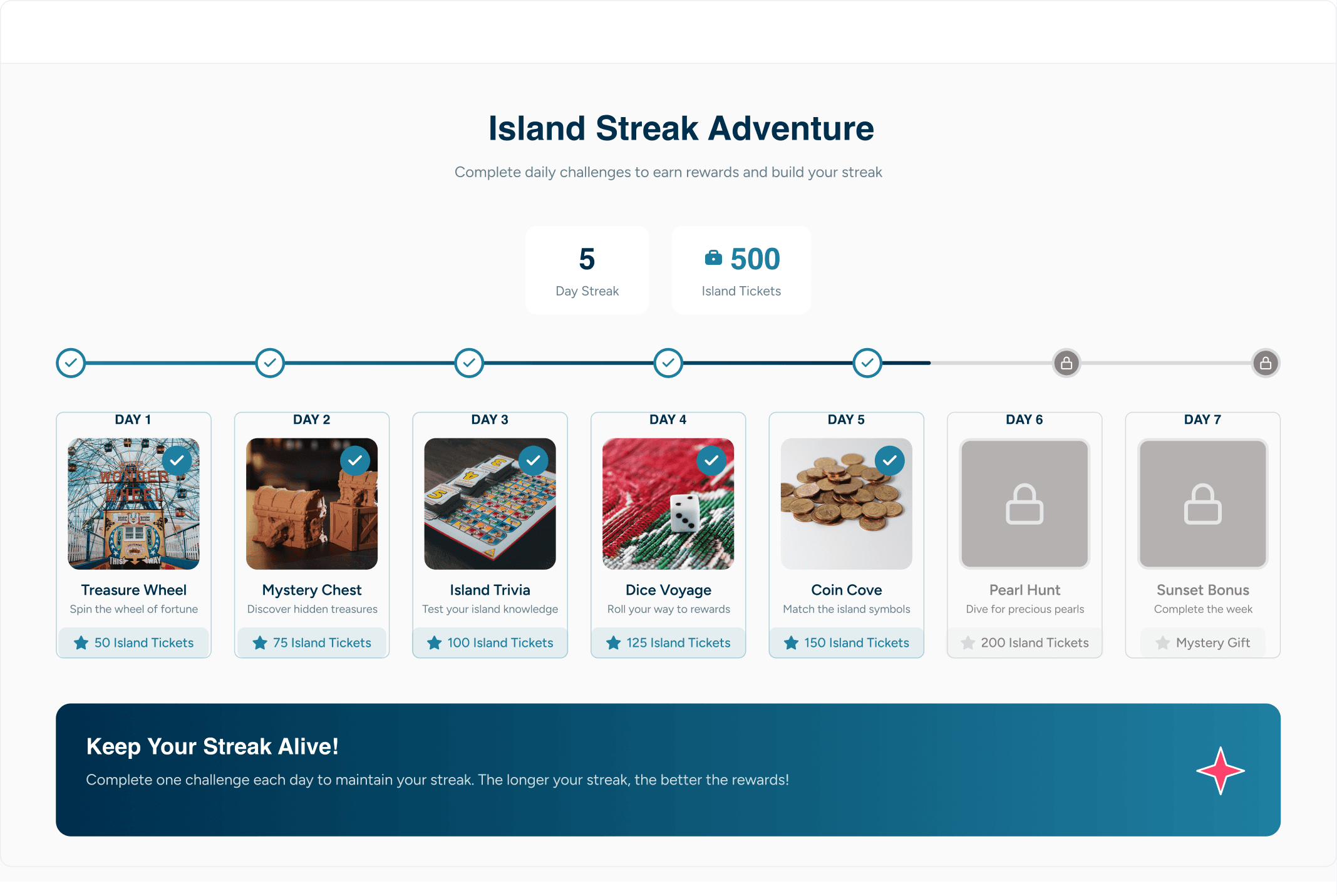
Challenge 03 — Gamification
Client said: "Add games to keep users on the platform longer. More time on site, more purchases."
The UX reality: Designing purely for session time is designing against the user. Variable reward loops, infinite game sessions, and fake urgency are dark patterns they spike short-term engagement and destroy long-term trust. A user who feels manipulated doesn't come back.
What I did: Reframed the brief entirely. Instead of "keep users on longer," I designed for daily return habit. Streak-based gameplay with a hard daily limit. Sharp cognitive games not slot machine mechanics. Tickets earned through skill, not chance. "Come back tomorrow" shown proudly, not hidden. The client got increased session frequency and a loyalty engine. The user got a fair, rewarding experience they'd actually want to repeat. Retention through trust, not manipulation.
Pushed back on the brief. Delivered a better outcome for both the business and the user.
Challenge 04 — Brand Identity vs. Unified UI
Client said:
“Every brand owner should be able to make their store look completely unique — their colors, their vibe, their layout.”
The UX reality:
If every brand uses totally different colors and styles without any system, the platform can quickly start to feel messy and unprofessional. Too many strong styles together can break the overall experience.
What I did:
I created a neutral base design for the platform — clean and minimal, without any strong brand colors in the main UI.
Then, I gave brand owners a structured system in the CRM:
Fixed layout sections
Controlled color usage through tokens — instead of letting brands use any color anywhere, I defined specific roles like primary, accent, and background. Store owners could apply their brand colors only to these roles (like buttons, product tags, Prodct cards, Links, etc.), keeping the UI consistent while still feeling personalized.
Clear content hierarchy
This way, brands could express their identity, but within a framework that kept everything consistent and polished.
Result:
Each store felt unique, but the platform still felt unified and easy to use.
UX Writing Initiative — Words that keep you on the island
Challenge:
The existing UX writing was very basic and transactional — typical e-commerce copy that didn’t match the 3D island experience. It felt generic and broke immersion.
The UX reality:
In an immersive environment, words matter as much as visuals. Generic copy disconnects users from the experience and makes the platform feel less engaging.
What I did:
I took initiative beyond my core design scope and rewrote key microcopy to be simple, intuitive, and island-themed — enhancing immersion without compromising clarity.
Empty cart → “No item in your cart. The island’s still waiting to be discovered.”
Explore stores → “EXPLORE THE ISLAND — Experience your favourite brand stores in one immersive digital space, just like walking into them physically.”
Loading... → “Setting sail...”
New stores coming in → “EMERGING STORES — Work’s in progress. When the gates open, you’ll want to be early.”
Know more about island → “THIS ISLAND? ONE WILD RIDE.”
Result:
A more cohesive and immersive experience where every word supports the island narrative — keeping users engaged throughout their journey.
Developer Handoff — When ever I design products I always keep the backend process in mind.
While designing the experience, I ensured every decision was feasible, scalable, and developer-friendly — not just visually appealing.
What I considered:
Color system logic:
The color customization was designed using a token-based approach, making it easy for developers to map brand colors dynamically without breaking UI consistency.CRM integration:
Every customizable element (navigation, layouts, content, colors) was structured in a way that could seamlessly connect with the backend CRM — ensuring store owners could make changes without affecting the core system.Clear boundaries:
I defined where customization is allowed (store-level branding, content, categories) and where restrictions are necessary (layout structure, core UI, accessibility) to maintain a consistent experience.System-first thinking:
Instead of designing one-off screens, I designed a flexible system that works across multiple stores, brands, and future scalability.
Final Takeaways — What The Island taught me about designing at the intersection of business, brand, and people
Good UX is not about saying yes to the client or yes to the user. It's about finding the answer that makes both feel heard.
Every brief I received on this project came with a hidden tension inside it. My job wasn't to resolve that tension by picking a winner it was to design my way through it so neither side felt like they lost. That's the skill. That's the work.
If you liked this project and would like to learn more, let’s connect.